Skip to content

Selecting the right exterior paint colors involves coordinating the home’s permanent features with the surrounding environment and architectural style. The most effective method starts by identifying the “fixed” elements of the property, such as the roof shingles, stone masonry, or brickwork, which will not change. Use these existing tones as a base to choose a primary field color, then select contrasting or complementary shades for the trim and accents to create a balanced look.
This guide provides a systematic approach to narrowing down thousands of options into a cohesive palette. By understanding how light, texture, and neighborhood context influence perception, any homeowner can achieve a professional result. Drawing on years of professional field experience, Local Painters provides the following technical and aesthetic advice to ensure these guidelines reflect real-world application.
Coordinate With Permanent Structural Features
Before looking at paint swatches, look at the parts of the house that are staying as they are. This includes the roof, chimney stone, driveway pavers, and even the windows if they are vinyl or aluminum and cannot be painted. These materials have underlying temperatures. For example, a roof might have a warm reddish cast or a cool blue-gray tone.
Choosing a color that fights these fixed elements often results in a house that feels disjointed. If the roof is a warm brown, cool blue siding might look out of place. Instead, consider colors that share the same undertones. A report by Zillow indicates that certain color choices, like “greige” (a mix of gray and beige), often perform better in resale markets because they bridge the gap between warm and cool tones.
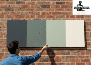
Follow the Rule of Three
A professional exterior color scheme usually consists of three distinct parts. This structure provides visual interest without overwhelming the eye.
- The Field Color: This is the primary color that covers the majority of the house.
- The Trim Color: This is used for window frames, door frames, roof lines, and railings. Usually, the trim should contrast with the field color.
- The Accent Color: This is reserved for small pops of color on shutters or the front door.
Using too many colors can make a house look cluttered, while using only one can make it look flat and unfinished. A common strategy is to stay within the same color family for the field and trim, simply moving up or down a few shades on the color strip.
Bonus Tip: For a modern look, try a “monochromatic” scheme where the trim is just one or two shades darker than the siding. This creates a sophisticated, subtle contrast.
Analyze Neighborhood and Environmental Context
A house does not exist in a vacuum; it sits within a street and a natural setting. While personal preference is important, the surrounding houses should influence the decision. This does not mean the house must match the neighbors, but it should not clash. A bright neon house in a neighborhood of historic earth tones will stand out for the wrong reasons.
The natural environment also plays a role. In a wooded area, earthy greens and browns help the structure blend with the trees. In a desert setting, tans and muted oranges might be more appropriate. According to data from the National Association of Realtors, curb appeal is a top factor in buyer attraction, and a color palette that fits the neighborhood context is a significant part of that appeal.
Evaluate Light and Reflectance Values
The way a color looks on a small card inside a store is never how it looks on a large wall in the sun. Sunlight “washes out” colors, making them appear lighter and more intense. A subtle gray might look white in direct afternoon sun, while a muted blue might look like a bright primary color once applied to 2,000 square feet of siding.
Homeowners should look at the Light Reflectance Value (LRV) of a paint. This is a scale from 0 to 100 that measures how much light a color reflects.
| Color Category | Typical LRV Range | Best Use Case | Heat Absorption |
|---|---|---|---|
| Bright White | 80 – 95 | Trim and modern accents | Low |
| Light Pastels/Tans | 50 – 75 | Main body in hot climates | Moderate |
| Mid-Tones | 30 – 49 | General siding for depth | Medium |
| Deep/Dark Tones | 5 – 25 | Accents or bold modern looks | High |
High LRV paints keep a home cooler by reflecting sunlight, which is especially important in warmer regions. Dark colors with low LRV numbers absorb heat, which can lead to higher cooling costs and potentially faster fading of the paint itself.
Bonus Tip: Always buy a quart of paint and apply it to a large piece of foam core board or a hidden section of the house. Look at it in the morning, afternoon, and evening to see how the shifting sun changes the hue.
Things to Consider Before Making a Decision
Before finalizing a color choice, review these practical factors that often get overlooked.
- HOA Regulations: Many Homeowners Associations have pre-approved color palettes. Getting a color rejected after the paint is purchased is a costly mistake.
- Architectural Style: A Victorian home can handle a more complex, multi-color palette, while a Mid-Century Modern home usually looks better with a minimalist, high-contrast scheme.
- Landscape Changes: Consider how trees and bushes change throughout the seasons. A color that looks great against green summer leaves might look dull against bare winter branches.
- Maintenance: Light colors show dirt and bird droppings more easily, while very dark colors show salt spray or dust more prominently. Mid-tones are generally the most forgiving for maintenance.
Common Questions About Exterior Paint
People often ask if the front door has to match the shutters. The answer is no. In fact, making the front door a unique accent color creates a “focal point” that guides the eye toward the entrance. This is an excellent way to use a bold color that might be too intense for the whole house.
Another common concern is whether to paint the gutters and downspouts. Generally, gutters should match the trim or the roofline to disappear. Downspouts should usually be painted the same color as the siding so they do not create vertical “stripes” that break up the visual flow of the home.
Expert Answers to Frequent Concerns
Does dark paint make a house hotter?
Yes, dark colors absorb more infrared radiation. Information shared by the Department of Energy suggests that dark, dull colors can absorb up to 70% to 90% of the radiant energy from the sun. This heat is then transferred into the home, potentially increasing utility bills in the summer.
How do I choose a trim color for a white house?
White houses offer the most flexibility. For a classic look, use a darker “off-white” or light gray for the trim. For a high-contrast, modern “farmhouse” style, black or charcoal trim is a popular choice. If the home has stone or brick, pulling a mid-tone gray or tan from those materials for the trim creates a cohesive look.
Should the garage door be the same color as the house?
In most cases, the garage door should match the field (body) color of the house. Painting service it the trim color or a contrasting accent color can make the garage the most prominent feature of the home, which usually detracts from the overall architecture. Matching the siding makes the garage door “recede.”
What is the most popular exterior color right now?
Current trends favor neutrals with organic undertones. Shades of “greige,” soft whites, and charcoal grays remain dominant. There is also an increasing interest in dark navy and forest green for modern architectural styles, as these colors provide a bold look while still feeling connected to nature.
Final Considerations
Choosing exterior paint is a balance of technical requirements and personal style. By prioritizing the fixed elements of the property and accounting for neighborhood context, you ensure the home remains a valuable asset. Furthermore, focusing on the Light Reflectance Value helps manage heat and long-term durability. By testing samples in different lighting conditions and following the rule of three, you can achieve a polished and enduring exterior that perfectly suits your architecture and climate.
Connect With Local Painters
For those who need assistance with the application or professional color consultation, Local Painters provides expert services tailored to the specific needs of each property. Ensuring a high-quality finish requires the right tools and preparation. To discuss a project or receive more information on exterior maintenance, contact Local Painters at 602-775-3019 or via email at localpaintersaz@gmail.com.
Sources
- Zillow – Real estate data platform providing research on how home colors influence sale prices.
- National Association of Realtors – Professional organization offering insights into curb appeal and residential property value.
- Department of Energy – Government agency providing technical data on heat absorption and energy efficiency in residential structures.